Loading... Please wait...
Recent Posts
- » Creating Impactful Feather Banners - A Guide to Design, Colour & Durability
- » Boost Your Business and Shop Front with Eye-Catching Flags
- » How to Choose Between Flags and Banners?
- » Understanding the Rules and Regulations for an Iconic Display of Patriotism
- » Types of Open House Signs for Effective Real Estate Marketing
- » Reasons Why You Need Good Logo Design
- » Why Real Estate A-Frame Signs & Sandwich Boards Are So Effective For Promoting Your Business
- » How Promotional Floor Mats & Branded Logo Floor Mats Can Help Promote Your Business
- » Promotional Flags for All Occasions - Focus Your Marketing Strategy and Get Noticed
- » How Customised Flags and Banners Can Help Your Business Grow
- » Teardrop & Feather Flag Banners – What is the difference? A Complete Guide and Best Uses for Each
Posted on 21st Feb 2025
A roller banner is an essential marketing tool that can make a big impact at trade shows, exhibitions or even inside your business. A good design grabs attention, delivers your message quickly and strengthens your brand, but simply placing a logo and some text onto a design template isn’t enough. Every detail from the size and colour to font choice and imagery all plays a role in how effective your banner will actually be. Here’s what makes a great pull up banner and how to get the most out of yours.
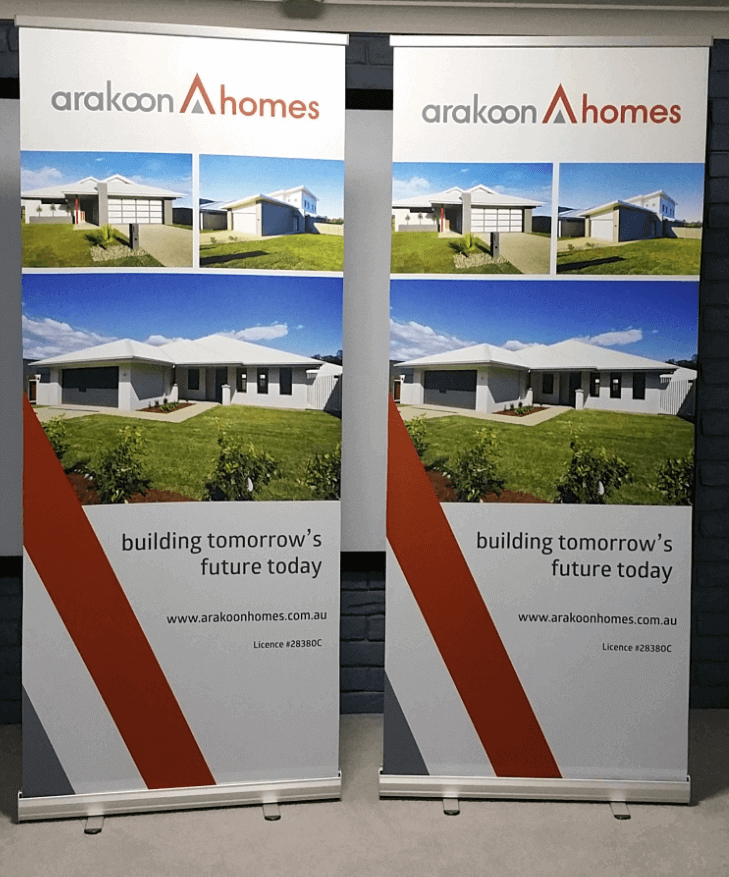
1. Getting Your Logo Placement Right
Your logo is one of the most important elements of your banner as it builds brand recognition and credibility. The best place for it? Well that’s right at the top as people naturally read from top to bottom, so having your logo in a prime spot makes sure it’s seen first. Make sure your logo is also high resolution because a blurry or pixelated logo can look unprofessional and weaken your brand’s credibility. Ideally, use a vector file like SVG or EPS to keep it crisp, no matter the size.
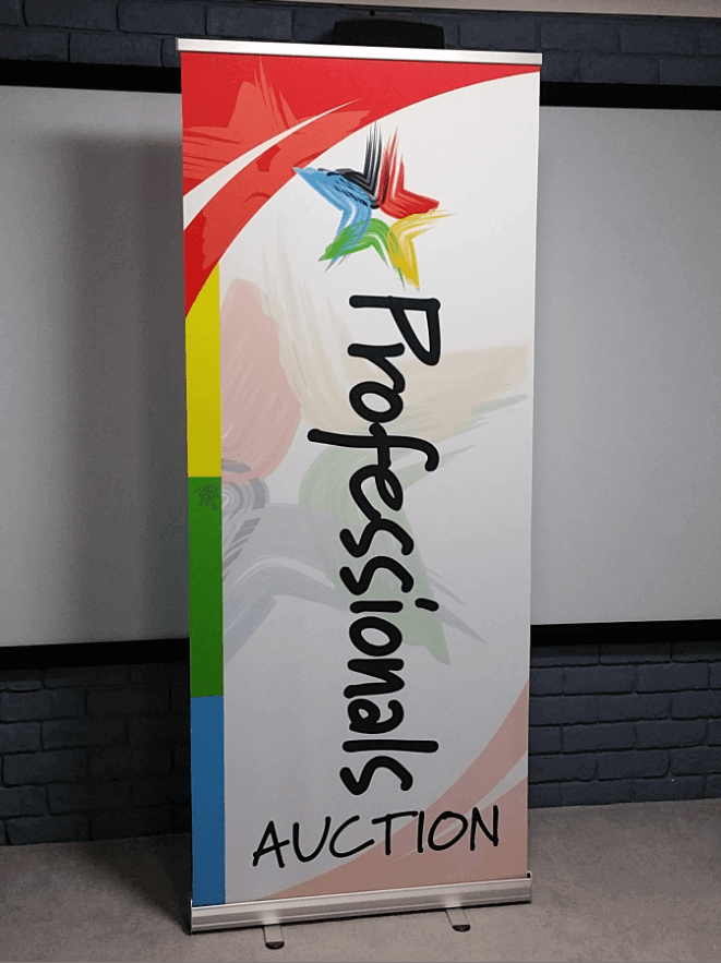
2. Keeping Your Message Clear and Concise
People only glance at banners for a few seconds, so your message needs to be simple and straight to the point. Keep text short and impactful, using strong phrases that instantly communicate what you offering. Place your main message near the top third of the banner, where it’s most likely to be noticed. Try to avoid long descriptions and ideally just stick to clear, easy to read language. Adding a call to action like “Visit our website” or “Call us today” gives people the next step to take.
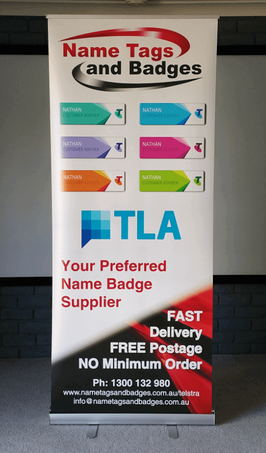
3. Choosing the Right Images and Graphics
The right visuals can make your banner stand out and as such using high quality images and graphics can help create a professional look and reinforce your message. Make sure any images are relevant to your brand and avoid overcrowding the design. A single, striking image or a few well placed graphics usually work best here. Again, for the best print quality use high resolution images (at least 300 DPI) to avoid blurriness when printed at large sizes.
4. Ensuring Readability with the Right Fonts and Colours
Your banner needs to be easy to read from a distance so stick to simple, professional fonts and avoid anything too decorative. Contrast is key for example dark text on a light background (or vice versa) improves visibility. Use different font weights or sizes for key information like bolding a call to action to guide the reader’s eye to the most important details. And also keep paragraphs short and break up text with subheadings if needed.
5. Don’t Forget Your Contact Details
A roller banner should always include your contact information! Whether it’s a website, a phone number, email or your social media handles, make it easy for potential customers to reach you. Place this information towards the bottom of the banner where it will be visible but not distracting from your main message.
6. Final Checks Before Printing
Before sending your banner to print, give it a thorough review. Spelling mistakes or design flaws can make your business look unprofessional so be sure to proof read the content multiple times and get a second opinion to spot any errors. Make sure there’s enough white space around the edges as a cluttered layout makes information harder to process, while a balanced design looks polished and professional.
 Hi Peter!
The Flags were a HUGE hit!!!!!!! Sorry for the last minute rush around – if I had of found you first it would not have been the problem – will know where to go first time next time :)
Really appreciate the service and the quality – we will be back! Thanking you again, Kind Regards,
Hi Peter!
The Flags were a HUGE hit!!!!!!! Sorry for the last minute rush around – if I had of found you first it would not have been the problem – will know where to go first time next time :)
Really appreciate the service and the quality – we will be back! Thanking you again, Kind Regards,